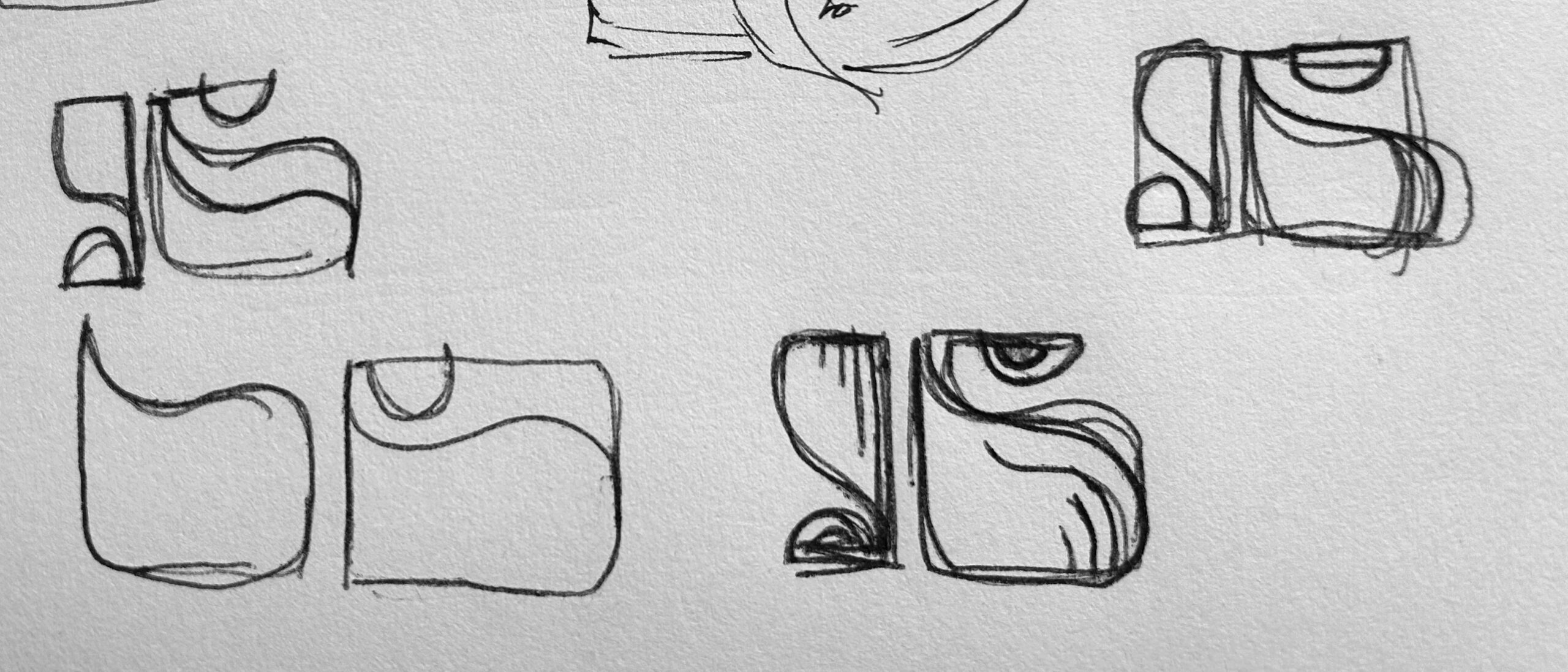
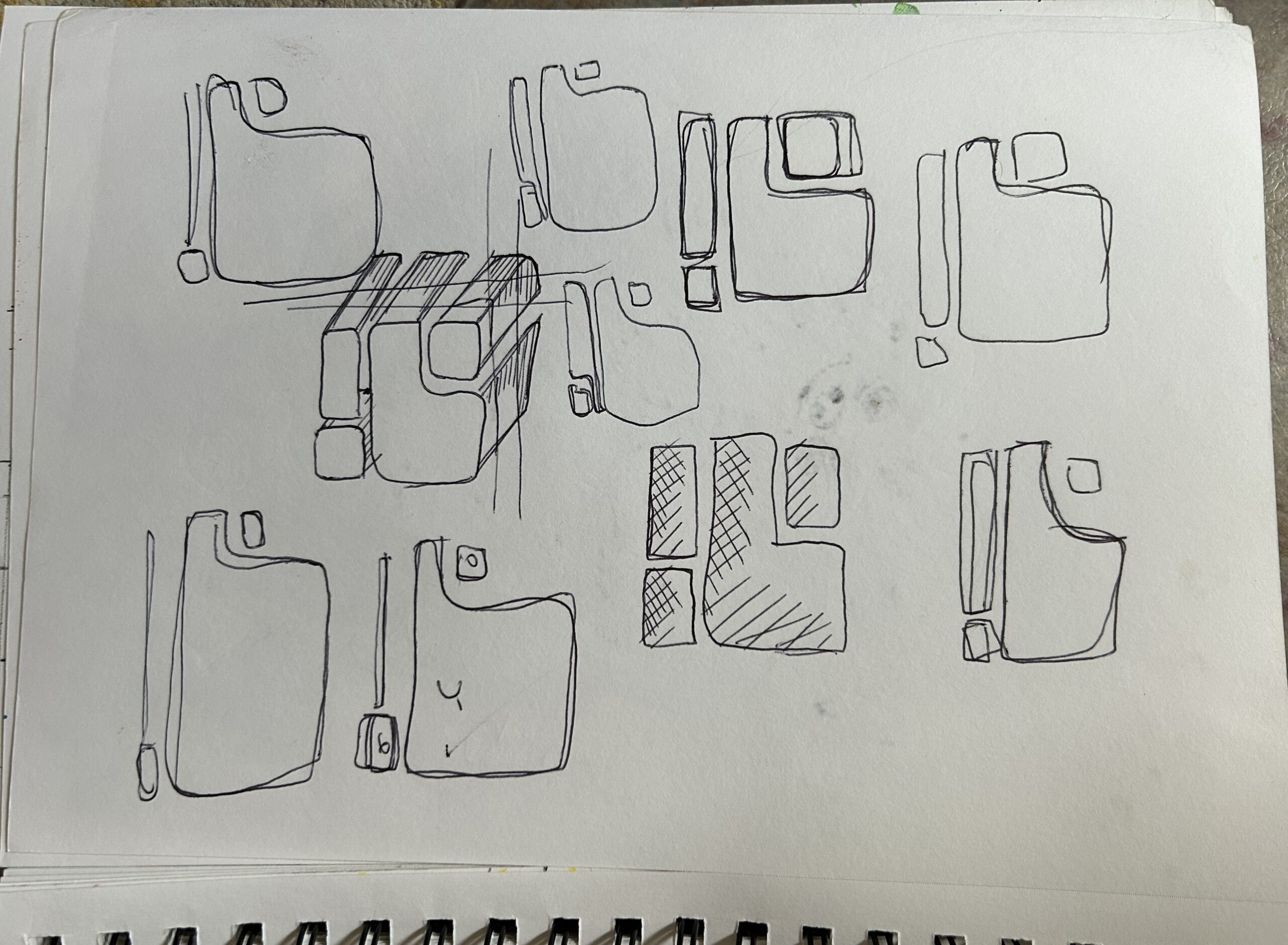
I have a love/hate relationship with creating logos. That said, some of my favorite graphic design work are the logos I’ve created. They require a lot of brainpower and tons of rough drafts, until, finally, I’m able to crack it open. Like a detective.
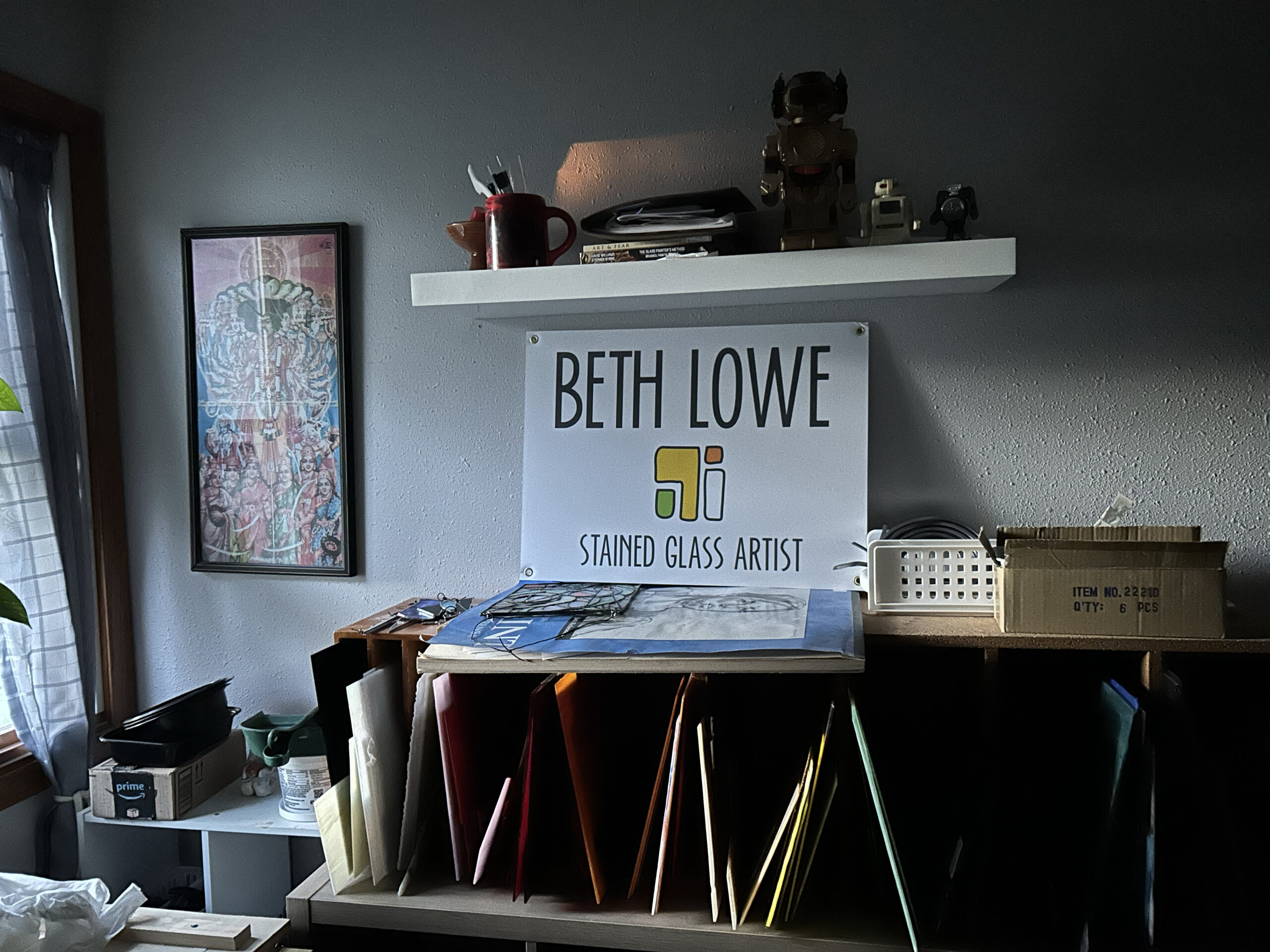
With the revamp of my site, I also updated my logo, and this post is about its origins.
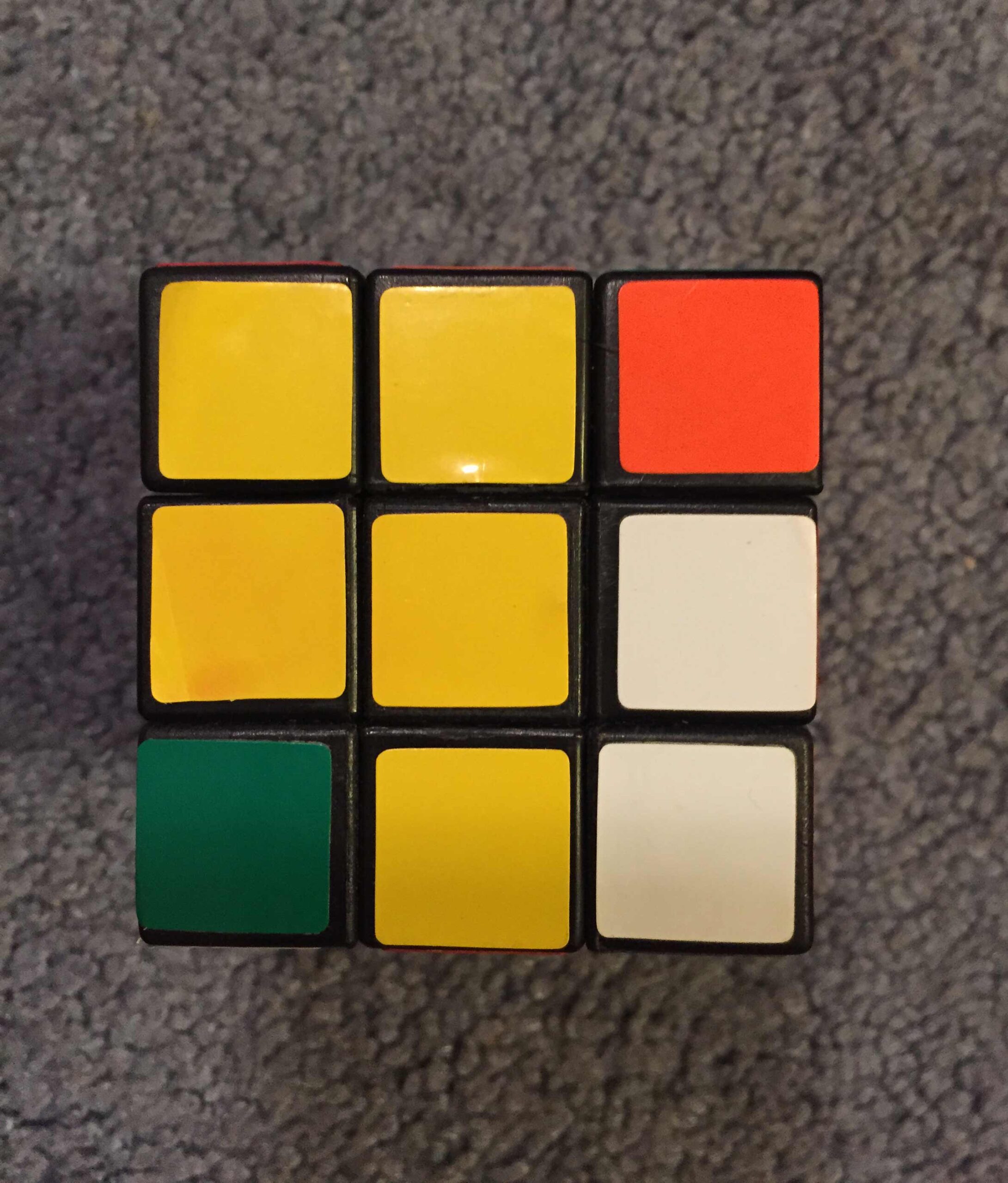
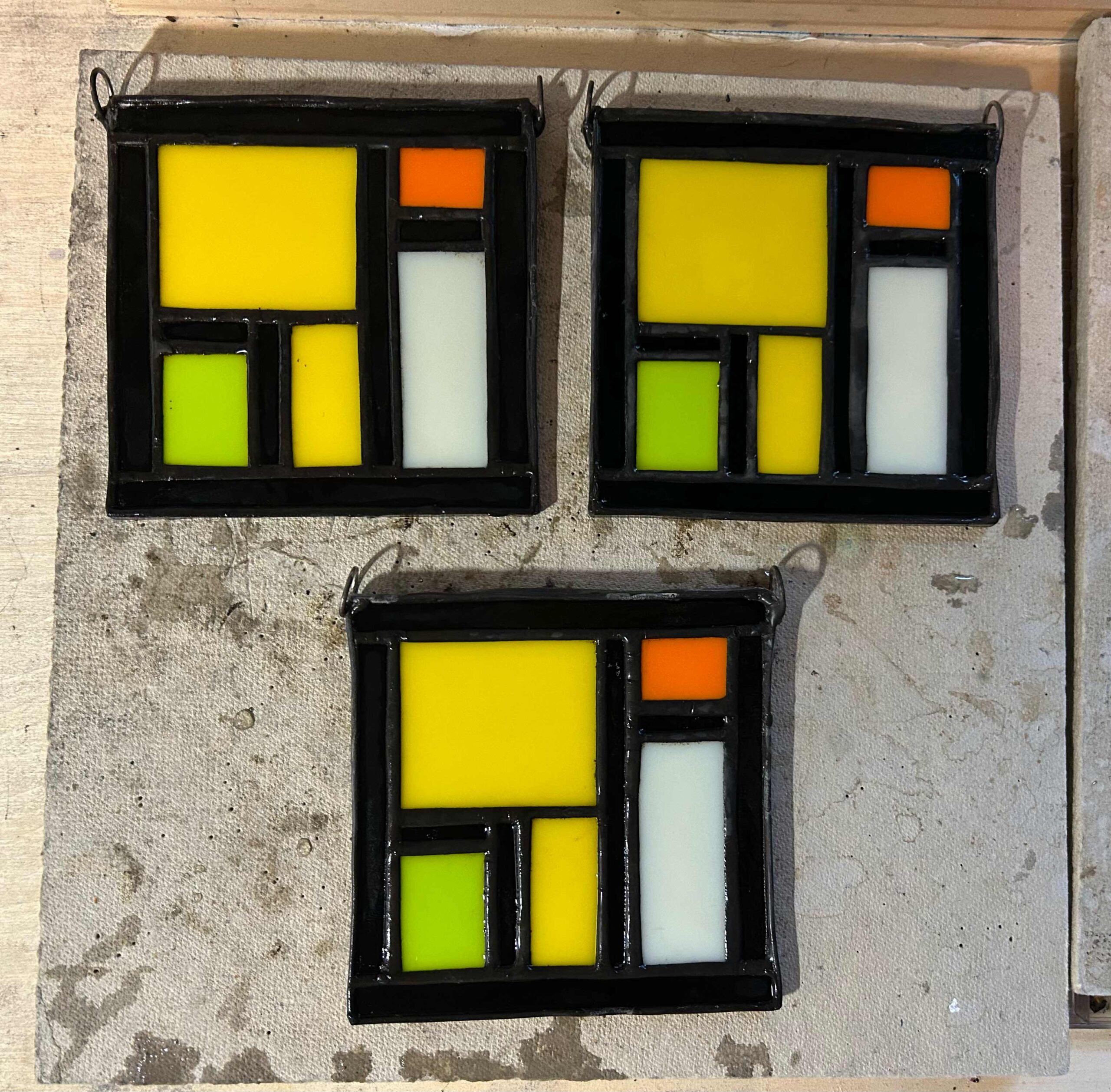
A couple of years ago, I opened a box of my old toys that had been hidden away for over 35 years, the same toys I packed up at age 10, thinking I’d be reunited with them soon. Over time, the box became buried in a storage room. As I dug through my time capsule, I found my old Rubik’s Cube (along with my robots…what little girl didn’t have a collection of those?). Before giving the cube to my youngest nephew, I snapped a photo of one side I loved.
When it came time to develop my art studio logo, that pattern became the perfect concept. It was important to keep the original colors and basic layout of the shapes. With this year’s updated version, I added elements that I often use in my stained glass panels. This logo represents my past, my present, and my future.